Luxe by Sey
“A luxury hair and beauty brand identity designed to communicate elegance, beauty, and sophistication through a cohesive visual system, premium product packaging, and coordinated brand applications.”
Private Client
Brand Designer
2026
4 Days

Brand Overview & Market Positioning
Brand Introduction
Luxe by Sey is a premium-oriented hair and beauty brand built around elegance, beauty, and sophisticated product presentation. The brand's visual identity reflects a commitment to creating a distinctive beauty experience through refined aesthetics, recognizable branding, and carefully coordinated product presentation. With a signature purple visual direction, elegant typography, and a distinctive hair-inspired monogram, Luxe by Sey establishes a cohesive identity that extends across product packaging, retail materials, merchandise, and promotional experiences. Guided by the philosophy "Where Luxury Meets Beauty," the brand represents an approach to beauty that values elegance, confidence, and visual distinction.
Brand Story & Heritage
Luxe by Sey is built around the idea that beauty deserves an expression of elegance. The name brings together the idea of luxury and a distinctive personal identity, creating a brand direction that celebrates sophistication and beauty. Its visual identity draws inspiration from flowing hair, graceful forms, and refined aesthetics. The signature monogram represents the brand's identity, while the rich purple palette and elegant typography establish its recognizable visual character. Every visual touchpoint is designed to communicate one consistent message: luxury meets beauty. Luxe by Sey — Where Luxury Meets Beauty.
Core Brand Objectives
The objective is to establish Luxe by Sey as a recognizable and distinctive hair and beauty brand through a cohesive visual identity and consistent brand experience. The vision is to build a beauty brand whose identity communicates elegance, inspires confidence, and creates a memorable impression across products, packaging, retail experiences, and digital platforms. Key objectives include: - Establishing a recognizable brand identity. - Creating a consistent visual language across all touchpoints. - Developing coordinated and premium-looking product packaging. - Strengthening brand recognition through consistent presentation. - Building a scalable visual system for future product and marketing expansion.
Market Positioning
A premium hair and beauty brand positioned around elegance, sophistication, and distinctive beauty experiences, combining refined aesthetics with a recognizable visual identity.
Target Audience
Beauty-conscious individuals, hair-care enthusiasts, customers interested in premium beauty products, and consumers who appreciate elegant presentation, quality-focused beauty experiences, and sophisticated branding.
Brand Personality & Archetype

Brand Strategy & Creative Direction
The primary creative challenge was to establish a distinctive luxury-inspired visual identity that communicates elegance, beauty, and sophistication while remaining recognizable across multiple brand applications. The identity needed to move beyond a conventional beauty logo and establish a consistent visual language that could translate effectively across product packaging, retail materials, merchandise, delivery branding, and digital advertising. A key consideration was maintaining visual consistency while adapting the identity to different formats, surfaces, and customer touchpoints.
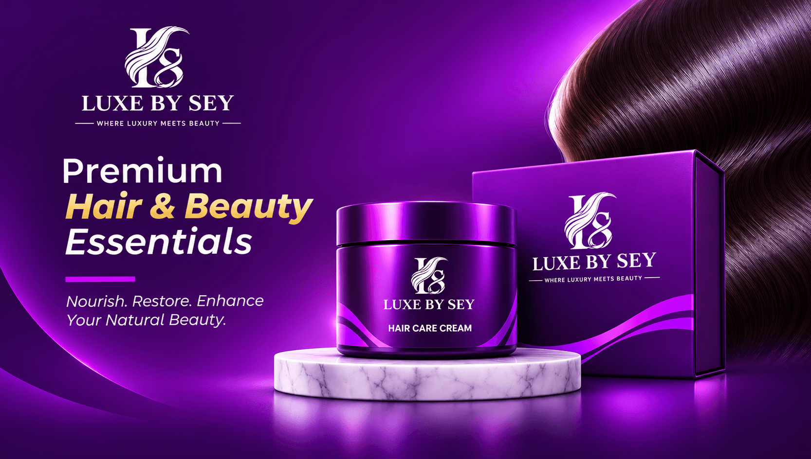
The creative direction is built around a modern luxury aesthetic, combining rich purple tones, elegant typography, flowing visual forms, and polished product presentation. The art direction emphasizes: **Color:** Deep royal purple, violet, magenta accents, lavender, and white. **Typography:** Refined serif lettering for the primary brand identity, supported by clean contemporary typography for secondary information. **Composition:** Balanced layouts, centered logo presentations, generous negative space, and strong visual hierarchy. **Lighting:** Soft gradients, luminous highlights, glossy reflections, and controlled contrast. **Graphic Language:** Flowing hair-inspired curves, smooth wave patterns, and subtle decorative elements. **Photography & Mockups:** Premium product compositions featuring clean backgrounds, marble surfaces, realistic shadows, and carefully positioned products. The overall direction is designed to make the brand feel elegant, recognizable, and visually cohesive.
Logo Identity Suite
Core mark, responsive orientations, and symbol architecture
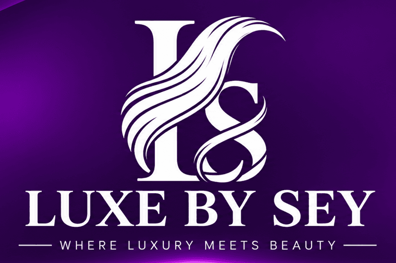
The Luxe by Sey logo is built around a distinctive monogram that combines elegant letterforms with flowing, hair-inspired curves. The central symbol features an artistic interpretation of the brand's initials, incorporating graceful flowing lines that reference hair, beauty, movement, and femininity. The flowing elements create a sense of elegance and visual movement, while the structured serif letterforms communicate sophistication and timeless luxury. The LUXE BY SEY wordmark reinforces brand recognition through refined serif typography, complemented by the tagline: "WHERE LUXURY MEETS BEAUTY." The white logo against the deep purple background creates strong visual contrast, allowing the identity to maintain a recognizable and sophisticated appearance. **Core Symbolism:** - Monogram: Brand recognition and identity. - Flowing curves: Hair, beauty, elegance, and movement. - Serif typography: Sophistication and refinement. - White: Clarity, simplicity, and contrast. - Deep purple: The brand's distinctive visual signature. Together, these elements establish a recognizable logo system that connects the brand's name with its beauty-focused positioning.
Brand Symbol / Icon
Favicon & App Icon
Secondary Lockup
Vertical / Compact Formats
Horizontal Wordmark
Navbars & Letterheads
Monochrome / 1-Color
Embroidery & Stamping
Brand Color Palette
Click any HEX code to copy to clipboard
New Brand Color
Primary brand touchpoints
New Brand Color
Primary brand touchpoints
New Brand Color
Primary brand touchpoints
New Brand Color
Primary brand touchpoints
New Brand Color
Primary brand touchpoints
Graphic Elements & Art Direction
The Luxe by Sey visual language is built around flowing forms, elegant curves, luminous purple gradients, and refined decorative accents that communicate beauty, sophistication, and luxury. The primary graphic motif is inspired by flowing hair, reflected in the curved elements of the brand monogram. These organic lines are extended into supporting wave patterns that create movement and visual continuity across brand applications. **Key Graphic Elements:** - **Flowing Wave Patterns:** Smooth, silk-inspired curves representing hair, beauty, elegance, and movement. - **Purple Gradient Effects:** Transitions between deep royal purple, violet, and vibrant magenta to create visual depth. - **Magenta Light Accents:** Subtle luminous highlights that introduce a modern, premium appearance. - **Gold Accent Lines:** Fine gold details used selectively to introduce an additional sense of refinement. - **Glossy Highlights:** Controlled reflective effects that enhance product presentation and packaging visuals. - **Geometric Composition:** Balanced curves, clean divisions, and structured layouts that complement the flowing graphic elements. - **Negative Space:** Generous open areas that allow the logo and key brand messages to remain prominent. These elements form a consistent supporting graphic system that can be adapted across packaging, promotional materials, merchandise, and digital communication without competing with the primary logo.
Design Outcome & Impact
“Working on Luxe by Sey provided an opportunity to explore branding beyond the creation of a logo and focus on building a complete visual experience. One of the most interesting aspects of the project was translating the identity into different applications while maintaining a consistent design direction. From the product packaging and shopping bag to the branded apparel, delivery concept, and promotional materials, each application required a different compositional approach while remaining connected to the same visual language. The project strengthened my understanding of visual consistency, brand application, creative direction, and the importance of designing with the bigger brand experience in mind. It also reinforced a principle that guides my design approach: **Good design creates recognition. Great brand identity creates a consistent experience.** Luxe by Sey represents my approach to transforming a visual concept into a cohesive identity that can live across multiple touchpoints. — Raymond Gaius Brand Identity & Visual Designer”
TrustLayer â Transparent AI Banking Interface
A fintech dashboard that makes AI banking decisions understandable disputable and trustworthy through explainable AI design.