Crafting Brand Identity That Scales Across Physical and Digital Touchpoints
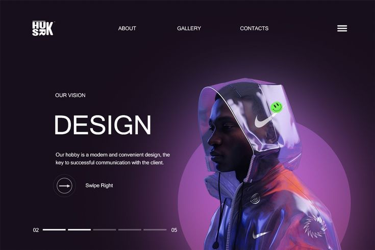
“How to establish a cohesive brand identity that feels equally confident on mobile screens, enterprise dashboards, and print materials.”
Brand Beyond Logos
A brand is not simply a logo or a color scheme; it is the sum of feelings, expectations, and memories that a customer associates with your product. When building digital brands, consistency is the foundation of trust.
Visual Ratios and Color Psychology
In digital experiences, colors convey hierarchy and urgency: - Primary Violet: Conveys technical sophistication, modern ambition, and depth. - Electric Cyan: Serves as a high-contrast accent for interactive states and focus rings. - Deep Navy/Ink: Grounds the experience, offering visual comfort and focus for long sessions.
Design Tokens as the Bridge
The bridge between brand guidelines and engineering implementation is the token system. When typography scales, border radii, and spacing variables are codified into tokens, design consistency remains uncompromised even as products expand into multi-platform ecosystems.
Enjoyed this article?
Share it with fellow designers & engineers.
Raymond Gaius
Product Designer & AI EngineerProduct Designer & AI Engineer at Rayida Tech. Building digital experiences people can trust across fintech, AI interfaces, and scalable SaaS ecosystems.